


Cupig: The Valentine's Day Pig (Part 2)
We're a New York Times Bestseller! Plus a behind the scenes look.

Cupig made The NY Times Bestseller’s list last week, and I couldn’t be prouder! I thought to celebrate, I would share some more behind-the-scenes sketches and my process of making the book. In my last post, I shared how CUPIG came to be and how it was a true testament to the importance of collaboration in children’s book publishing. The actual making of CUPIG the book was no exception.
To start each project, especially one so character-based, I always complete a character turnaround sheet to help guide me through the dummy book-making process. This helps me keep the character more on model throughout the book but also helps me slow down to make better character decisions without worrying about the whole book spread. I try to keep it separate in the beginning so I know the main character can stand alone without the support of other characters first, then introduce them to the story.

I usually complete my character model sheets in Adobe Illustrator in order to focus on the shape design choices I make and how they change when the character’s pose turns. It also helps me to simplify character features to their most important aspects, which helps a lot with my rendering style of adding in texture elements after.
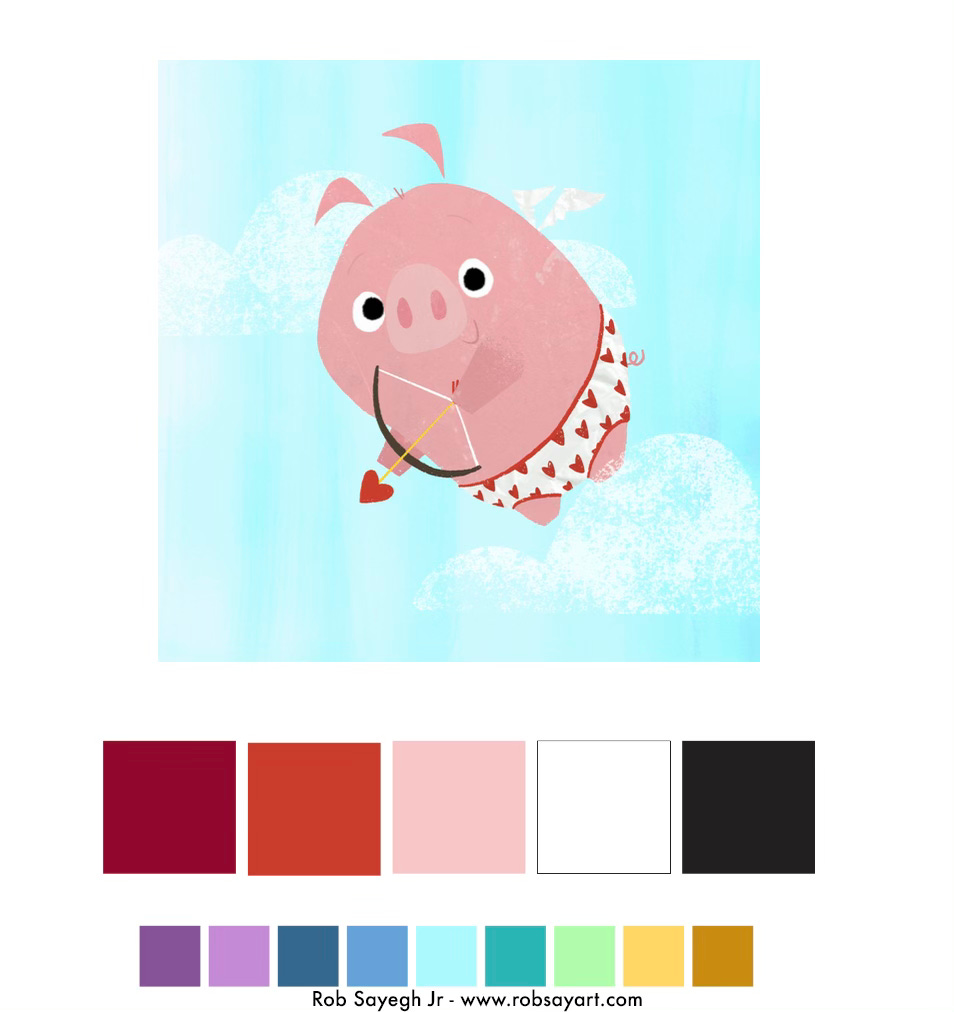
I will then move on to a color palette that shares my idea for the types of colors that I will be using throughout the book. Obviously, with a pig and it being a Valentine’s Day book, I knew I needed a lot of pink. Still, I also wanted to make sure it wasn’t just red and pink throughout the book, which is why we decided to bring in the blue that represented the sky to balance that out a little more. I always separate my primary palette and my secondary palette as a reminder to emphasize specific colors over others.
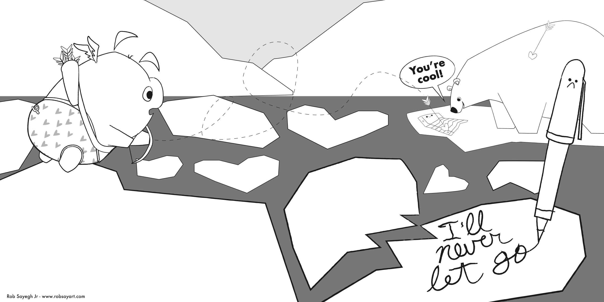
Once the color palette and character turns are approved by the team at the publisher, I usually move right into the dummy, but in this case, I just focused on the scenes that contained the famous couples being broken up. The reason for this was that I thought it was the throughline and the repeating joke of the book. So, each one needed to be silly on its own and express the same feelings of separation. This was also when we tried a few different silly combinations of couples to see which worked best for kids while still being silly. Some that didn’t make the book were a truck and the moon, a cooking pot who loved a submarine, and others.


As I drew out the jokes in each, we added the little speech bubble to add a secondary joke line to each couple being broken up. This helped decide which couples worked best and began to shape the story’s repeating pattern, which kids always love. I completed these sketches in Illustrator as well, which I love to do if I can because I can use the shapes I make in Illustrator as the flats for my rendering, which saves me a ton of time throughout the rendering process, but it doesn’t always work. Thankfully, it did here for most of the project. (More on that soon!)
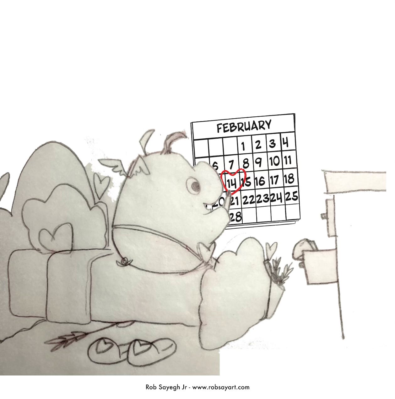
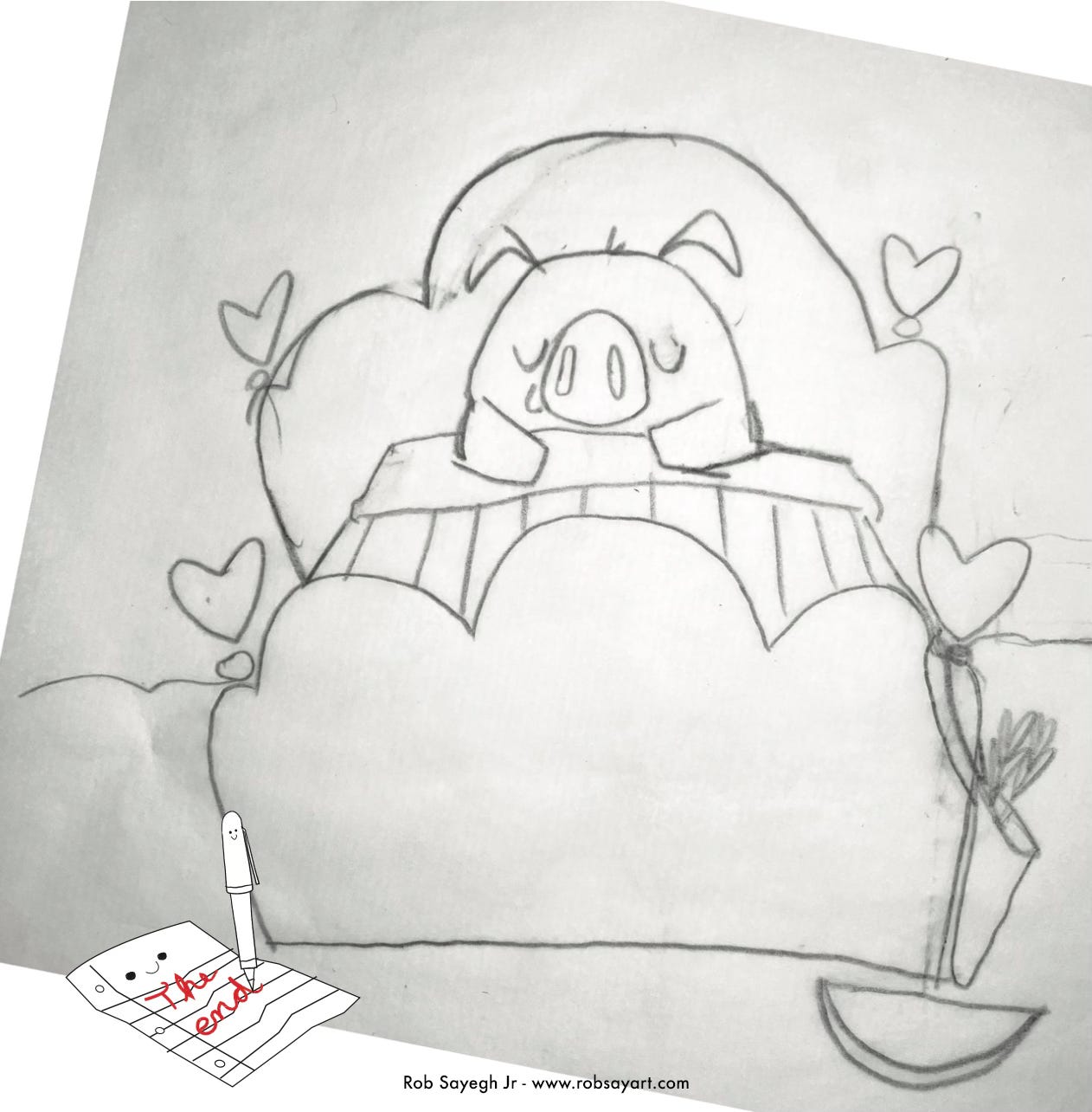
After we nailed down the couples, we decided that Cupig herself should start and end in her own home so she had a sense of place and being. So we decided to give Cupig her room and home in the clouds. I sketched these by hand and added them to my illustrator file to show the Flamingo team what I thought. They loved it, and we added it to the book’s beginning and last page.
I used a light blue watercolor wash as the background for my rendering textures to compliment the heavier textures used for the characters and Cupig. The clouds are a crumpled-up tracing paper texture that I use all the time in children’s books and has really become a core member of my rendering palette to help balance things.
Below are some images of the final product. Working on this book was an absolute blast, and its recent success is truly the icing on the cake.


Thank you for sharing your process!